As you may recall from a recent post about fossil fuel divestment, fossil fuels will soon become a stranded asset, meaning we can not afford to pull it out of the ground and burn it.
The concept of carbon budgets was explored in depth in a report by the Carbon Tracker Initiative and the Grantham Research Institute, called “Unburnable Carbon 2013: Wasted capital and stranded assets,” which we went over in detail in a earlier post.
As discussed before, a carbon budget is not hard to figure out, because the relationship between how much carbon is burned and the increase in temperature is relatively well know.

( Data from Carbon Tracker Initiative / Grantham Research Institute )
In 2014, the burning of fossil fuels worldwide pumped over 35 gigatons of carbon dioxide into the atmosphere. The 900 gigaton budget, shown above, was for 2013; so we have to subtract the 35 gigatons of carbon produced in 2014 from 900, to see that we only have 865 gigatons left of carbon dioxide in our budget.
If we only have 865 gigatons left, what might be the best way to spend our carbon budget before we blow it on gas guzzling SUVs, cheap throw-away electronics and other assorted disposable, plastic wrapped gee-gaws and doo-dads?
That’s easy enough figure out. We can just plug-in our 865 gigaton budget into a spreadsheet, subtract by different amounts per year, and then make some pretty graphs to make it easy to understand.
Each graph below shows four lines (click on the graphs for a larger versions)…
- The purple line shows a cut of 1.0 gigaton per year.
- The green line shows a cut of 0.75 gigaton per year.
- The red line shows a cut of 0.5 gigaton per year.
- The blue line shows what happens if carbon output remains the same.

Exceeding our budget happens when the x-axis is crossed, at zero gigatons of carbon remaining. As you can see by the graph above, cuts of 0.75 and 1.0 gigatons per year will keep us from going over budget, and keep the world from getting warmer than two degrees centigrade (~3.6 F).
The red line, showing a too modest cut of 0.5 gigaton per year, will put us over budget by about 2046. While the blue line, the business as usual line, will put us over budget and into unknown territory by 2039.
The next graph shows this info in a different way.
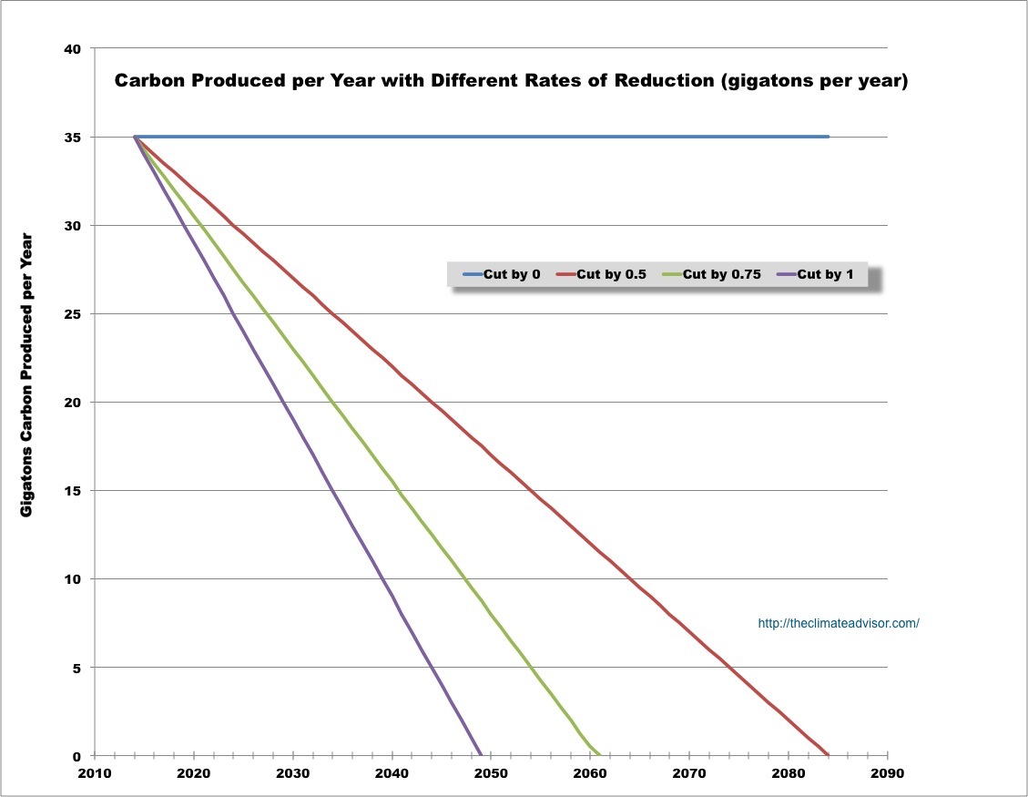
This graph shows how much carbon dioxide we can emit planet-wide each year. The year we get to zero carbon emissions is where the lines hit the x-axis.
If it’s business as usual (blue line), we never get there. If we cut by 0.5 gigatons per year, we get there in 2084 — after blowing through the 2 centigrade warming ceiling. If we cut by 0.75 or 1.0 gigatons per year, we’ll get to zero emissions in 2061 or 2049, respectively.
An important point to note is that the 1.0 and 0.75 gigaton cuts per year, leave us a cushion of 270 or 65.75 gigatons, respectively.
These graphs are not necessarily accurate. The burning of fossil fuels may increase or decrease, depending on a lot of political and other factors.
While in the U.S. and other industrialized nations carbon emission are dropping, the emissions of developing countries are rising. Also, carbon capture technology may be developed and deployed on a large-scale, which would alter the balance favorably. Also, a two degree centigrade ceiling may be a really bad idea — maybe the ceiling should be lower.
These graphs may not be accurate into the future, but they show us where we are at right now. AND, they give us a pretty good idea of where we are heading… and what we need to do about it.
What do you think?