It may sound a bit crazy, but at least as far as carbon dioxide goes, it may not matter how much electricity you use, what kind of appliances you have, how well your house is insulated, or any other factor.
Probably THE single BIGGEST thing you can do to reduce you and your family’s impact on the world’s climate is to use alternative energy. Using less power and switching to alternative energy means you make less carbon dioxide. Carbon dioxide is made by combustion of fossil fuels, and it is THE cause of global warming, and the destructive climate change that goes with it.
You may remember a recent post on this blog that showed how using CFL or LED lights saves energy and reduces your carbon footprint. That was followed by another post that showed that the type of power you use has much more impact on how much carbon dioxide (CO2) you make than the types of bulbs you use.
In this post we will take it one step further and estimate the amount of CO2 that’s created supplying ALL of the electricity to our homes in one year, for different sized homes, in different regions, and in different climates of the U.S. Just to refresh, the amount of electricity used by a home is measured in kilowatt hours (kWh). An air conditioner that uses a thousand watts in an hour, uses one kilowatt hour of electricity, while a 100 watt light bulb would take ten hours to use one kilowatt hour of electricity (100 watts x 10 hours = 1,000 watts = 1 kilowatt hour).
How much carbon dioxide?
Just like the earlier posts on electricity, I’ll use BlueSkyModel.org to tell us how much CO2 is made by different energy sources. The data I use is summarized in the table below.
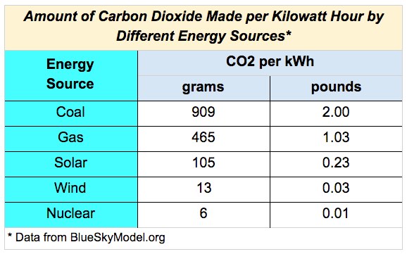
This table shows that coal is a major source of CO2, while gas makes about half as much. Gas looks like the “bridge” to widespread use of alternative energy that some energy pundits talk about. Although the way things are going, we may just fly over the “bridge” and go straight to alternatives such as solar and wind energy.
Nuclear makes the least CO2, but has a lot of issues (Three Mile Island, Chernobyl, & Fukushima, to name three). Although, I do think an “all of the above” policy may make sense for our energy future over the next decade or so if we are to avert disaster. Who knows, maybe someday soon those small, safe reactors that you hear about will become a reality. That might change the equation a fair bit, but in the meantime wind and solar are the best bet, by far.
To make all the simple graphs you’ll see here, I combined the BlueSkyModel.org info above with U.S. Energy Information Administration (EIA) data. The EIA website is the place to go to find easily accessible info about how America uses energy. Most of the data here is from the EIA’s Residential Energy Consumption Survey, done in 2009.
All of the graphs shown in this post are for one year of electricity used by one single home, unless otherwise stated. Also, all the charts are about electricity use alone, and do not consider fuel oil, natural gas, propane, or other fossil or bio fuels. So, although we’re talking about a big part of the problem, we’re just seeing one slice of the bigger carbon pie. Also, in a future where energy is provided by alternatives, most cooling, heating and other energy use will be electric, so the information here may be even more relevant.
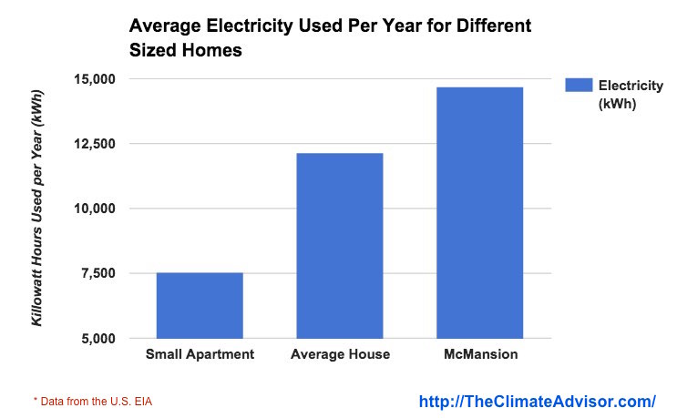
Carbon Dioxide and the Size of Your Home
In our earlier posts about lighting, I used different sized homes including a one bedroom apartment, an average three bedroom house, and a “McMansion.” A “McMansion” in this case is roughly equal to a large 4 – 6 bedroom house. I use EIA data for square footage that corresponds to those divisions to make this next graph.

It makes sense that the bigger your home, the more energy you use, and that’s just what we see. What’s not so obvious is that most of the energy used is for the first person. In other words, each additional person after the first one, doesn’t add as much energy use. That’s because you have to heat or cool your home to a certain level of comfort, whether you are one person, or six people, for example.
The next chart shows how much CO2 can be produced using different sources of energy to generate electricity for those different sized homes. To get these numbers we just multiply the Blue Sky Model numbers by the amount of energy used to get the amount of CO2 produced.
 What’s interesting is that a single person in a one bedroom apartment getting electricity from a coal-fired power plant will make WAY more CO2 than a big house that’s powered by alternative energy (dashed line between blue column on the left and orange column on the right).
Because coal and gas makes so much CO2, it’s hard to see the relative contribution of the different alternative energy sources. So the next graph shows just the alternative sources.
 As we saw in the previous graph, solar is much, much better than coal. BUT wind power is even better than solar; at least as far as CO2 is concerned. ALSO, one person in a small apartment using solar energy still makes more CO2 than a large family in a McMansion using wind power (dashed line). Solar is awesome, but wind power wins again!
Carbon Dioxide and Where You Live
The next graph shows electricity use by region. You can see that the South uses far more electricity than any other region of the country. This is true because I would guess that the South uses a lot more air conditioning than any other region, and air conditioners are major electricity hogs. Also, it’s interesting to see that the Northeast ranks lowest for electricity use. Why might that be?
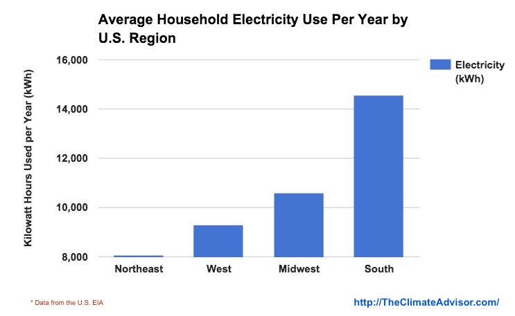 Looking a bit deeper into the data I find that the Northeast uses more fuel oil and kerosene than the rest of the country combined, probably for heating in the winter. And remember, these charts are for electricity alone.
Also, the summer cooling needs in the Northeast are not nearly as great as the rest of the country, especially when compared to the South. It’s interesting to ponder that if the South is the biggest user of electricity, then what sort of impact would alternative energy have on their CO2 production?
 As expected, using alternative energy to power the South would cause a huge reduction in CO2 production, versus coal.
Air Conditioning and Carbon Dioxide
Here’s a graph of the relative percent of energy used for air conditioning by different U.S. regions. If you add up all the energy used only for air conditioning, then divided it up by region, you can see who eats most of the “air conditioning pie”.
 As you can see, the South uses the most energy for air conditioning. The South has the most housing units, according to the EIA data, nearly double of any other region. But, the amount of energy they use for air conditioning is much more than just double the other slices of the pie.
One important point to think about — worldwide electricity for air conditioning accounts for about a trillion kilowatt-hours of energy used per year. As China, India and other developing countries become affluent, that number could grow by TEN times. That’s a huge increase in CO2 produced if alternative sources for electricity are not adopted; and unfortunately, it’s still a huge increase in CO2 even if alternative energy is widely adopted.
(Here's an excellent summary about the future of air conditioning and it's climate impacts --> Click Here )
Climate Zone and Carbon Dioxide
The next graph shows electricity use by climate zone in the U.S. As you might expect, the humid areas, like the Southern U.S., have the highest energy use.

Our old friend air conditioning strikes again! The Mixed-Dry/Hot-Dry climate uses the least electricity, which was expected. Warm dry air feels much less uncomfortable than warm-humid air because your sweat evaporates in the dry air, which helps cool you. That’s also part of what an air conditioner does — dry out the air in your home so it feels more comfortable.
The next chart shows how much CO2 is made per year generating electricity from different sources for the dry versus humid climates.
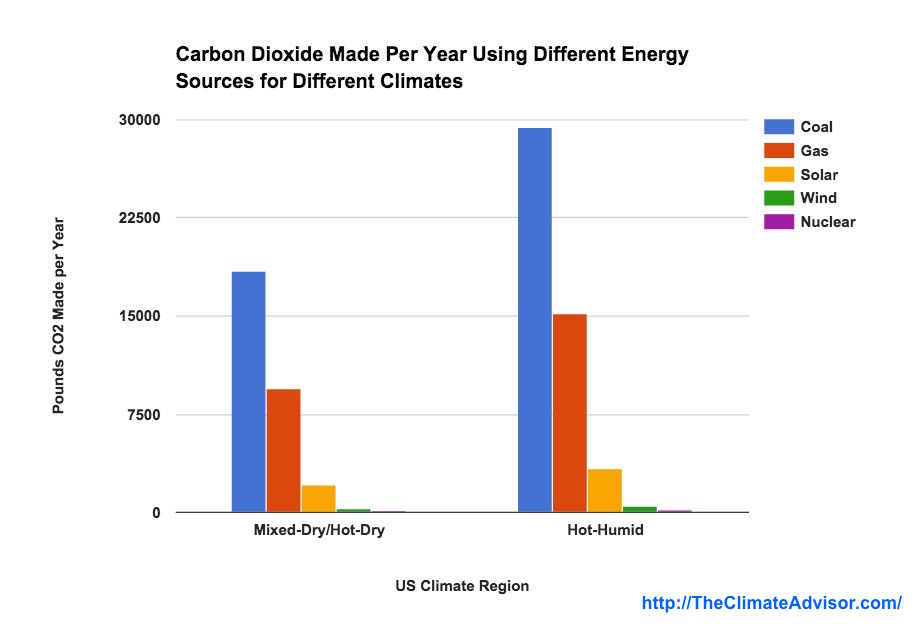
No surprises here. Hot-Humid uses more electricity, thus makes more CO2, especially when fossil fuels are used instead of alternative energy sources.
Again, a reminder. All of these charts are electricity used and CO2 produced for just one single household. To get the big picture, multiply these numbers by the 150+ million households in the US and you get the yearly CO2 production of the whole country. And this does NOT include the CO2 made by using other household energy sources for heating, nor for electricity used in industry, manufacturing or transportation!
This article is not about where different regions actually get their power from, but about what would happen if they got it from alternative sources. Right now, the US electric supply is dominated by coal and gas-fired electric plants, although solar and wind power is growing much faster than the pundits predicted. What would it look like if ALL of the U.S. electricity was generated by alternative sources? How much could we cut our CO2 generation?
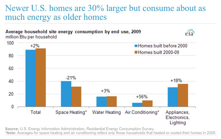
Bigger! Better! More! More! More!
Another important point, the average American house has grown in size since 2000, but uses about the same amount of energy. So even as houses have gotten bigger, they are more efficient. But, a lot of resources are also used to build those larger houses in the first place. AND if you look at the air conditioning column in the second graph, you can see that one has gotten worse. That’s because even though a new, larger house is more efficient, it’s still takes more energy to cool a larger space!

Here’s a novel idea, what if we lived in houses that were both smaller AND efficient? We’d really be reducing our impact on the world’s environment, without necessarily decreasing our quality of life. I mean, if you asked your parents or grandparents how they felt about living in a smaller house when they were young, I bet they’d say it wasn’t a big deal.
I would argue that living in smaller homes, accumulating less stuff, and leading a simpler life would actually be a BIG boost to our quality of life. We have to challenge the notion that is beaten into our heads everyday by an endless stream of commercials, that bigger is better, and more of everything is good. This is the old way of thinking. We need to look at how we can sustain ourselves. Unchecked pursuit of growth is what cancer does. We can, and we must do better, if we want the human race to live past the next 100 years (I’m not exaggerating even one bit here).
Save the world!
Anyhow, I usually like to end a post by giving you some ways to make a positive difference in your life. But I feel that’s what this whole post was about.
Switch to alternative energy now and save the world!
“But, Doc Goodwell, hold on just a minute!” You might say. “Easier said than done. How the heck can I do that?” Ahh, excellent question. I will leave you hanging for the moment… but not for long. Please stay tuned for a blog post on the relative costs of energy from different sources AND how to get your home hooked up to alternative energy.
In the meantime, if you have any thoughts about how to save the world, or on ways to save energy, please Tweet me, or comment below. Also, please subscribe to the email list to receive updates.
Thank you for reading.