<June 2022- Please note, some of the tools and methods in this post may be out of date as the original was written 4 years ago. An update to this post is planned in the next month or two, so please check back or subscribe by email to be notified of any updates or new blog posts. Thanks!>
There are many climate change maps and tools that you can use to figure out your personal risk to climate change. The Climate Advisor searched the web for the best interactive climate change visualization tools. Sites that give information in a map were preferred so that changes could be visualized. Some static maps or other tools were included if they were especially good, or if there were no interactive maps available for that bit of data.
This post will be regularly updated as new tools are discovered. Links to previous articles in this blog relevant to each topic are also provided.
How to Best Use Interactive Maps
When using an interactive map it’s best to start with a wide view, then zoom in to see how your region is impacted. Also, some maps have many variables you can fiddle around with to see how the different parameters change the outcomes. How to use each map or tool will be described. Important questions you might have are also addressed, such as…
What is an “RCP”?
RCP means “Representative Concentration Pathway”, fancy speak for “how much CO2 humans will dump in the atmosphere”. The amount of CO2 put in the atmosphere directly correlates to the eventual amount of warming. RCP2.6 is a scenario where drastic cuts to CO2 production are made, while RCP8.5 is the scenario where nothing is done to curb emissions. Most mapping tools default to RCP8.5 (worst) or 4.5 (modest efforts to reduce CO2).

A Word About the Use of Computer Models to Make Projections
Most of the tools shown below are based on climate modeling. If you believe the denier hype, climate models are wildly inaccurate. In truth, climate models are robust and get better all the time. Models have been built over many decades by tens of thousands of highly intelligent and devoted scientists. The models are continually tested using data collected by tens of thousands of climatologists, geologists, biologists, oceanographers, foresters, and other scientists.
Like the famous mathematician George Box once said, “All models are wrong, some are useful”. What you see below is an application of many useful models — information that you can consider when judging your own personal risks to climate change.
Here is a wonktastic article on climate models from Carbon Brief… Analysis: How well have climate models projected global warming?
All right, let’s get started!
Explore your risks of…
- Heat – What is your risk for heat waves? This risk also drives other risks such as drought and economic impacts.
- Drought – How dry will it get? Important for urban water restrictions and economic activities like farming and ranching.
- Extreme Rainfall – More or less rain, but you’ll get it all at once.
- Coastal Flooding – Sea level rise threatens to swallow coastal cities from Texas to Maine.
- Forest Fire – Epic forest fires are becoming common if you live in the Western US. How bad will it get?
- Economic Impact – The one that ties them all together. What’s the bottom line?
Heat
Knowing the risk of extreme heat where you live is important for your health due to the risk of heat waves and heat stress. It’s also important for forest fire, drought, power outages, decreased agricultural production, and economic losses, among other things.
There are plenty of maps showing the changes in temperature with climate change, in fact this was obviously the first sort of graph or map that was made. However, there weren’t too many that allowed you to drill down to the state or local level. Fortunately with the increasing sophistication of climate models and and ability to visualize that data, there are some great tools to see just how hot it will get where you live.
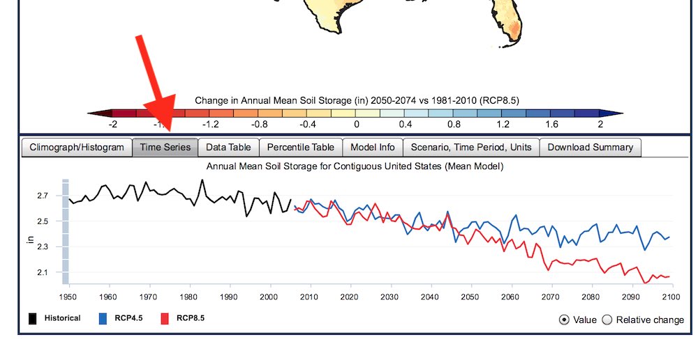
US Geological Survey Climate Viewer – The USGS is one of the country’s premier scientific agencies. They have put together a robust and powerful tool that drills down to the county level. This tool is very comprehensive, covering many different climate parameters, including: max temperature, min temperature, precipitation, runoff, snow, soil storage, and evap deficit. They use 30 different climate models. Some models show less change, some show more. This tool defaults to the average of the models, but you can pick individual models to see the difference.


New York Times’ How Much Hotter is Your Hometown – Although not a map, this is a really interesting tool that shows you how much hotter the place where you were born is, comparing when you were born to today, and to the future. Of course, if you live somewhere else from where you were born, you can enter any place to see the change from past, to present, to future.
It shows the number of hot days at or above 90 degrees F per year, under the RCP4.5 scenario, meaning modest to strong action is taken to prevent further warming (we are currently on or close to the worst case RCP8.5 scenario). This tool also shows changes for other cities around the world. Plots were generated by the Climate Impact Lab, using data from Berkley (historical) and NASA (21 models, projected). One shortcoming of this tool is that if the place you enter has historically not had 90F degree days, it will not show future projections. However, plenty of places that have never had 90F days, will have them in the future.


Drought
Estimating the risk of drought is a little complex because it is a combination of several different factors. However, the main driver is temperature, especially winter temperatures. A warm winter results in more evaporation of moisture from the soil. Shifting rain patterns determine how the soil moisture is replenished. How climate change affects temperature and rainfall are two of the best understood parameters.
A specific mapping tool to estimate future drought is difficult to find, but the USGS Climate Viewer has two parameters that give good approximations. There have also been many excellent studies of future drought by atmospheric scientists. Some static maps are shown from those studies. The US Department of Agriculture (USDA) has an excellent website with a current, static map of drought conditions.
US Geological Survey Climate Viewer – The USGS’ Climate Viewer tool is almost one stop shopping! For drought we can look at “soil storage” and “evaporation deficit“. Soil storage indicates how much moisture is kept in the soil, while evaporation deficit shows how much is taken out of the soil. As described above, you can either use the menu to drill down to your state and country, or just click on the map. This soil moisture information will obviously show you the potential impact of climate change on agriculture.

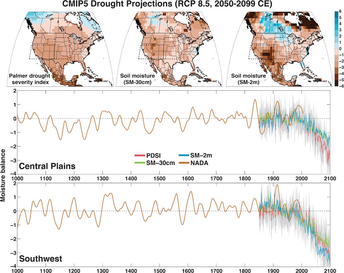
Future United States Drought Risk Maps – These static maps are from a study titled “Unprecedented 21st century drought risk in the American Southwest and Central Plains.” This was a study done in 2016 by a team of scientists from NASA, Columbia and Cornell Universities. They used historical climate data to calibrate results from 17 different climate models. The models were used to predict the past to see how well they worked, then applied to future conditions, focussing on the Central Plains and the Southwestern United States.

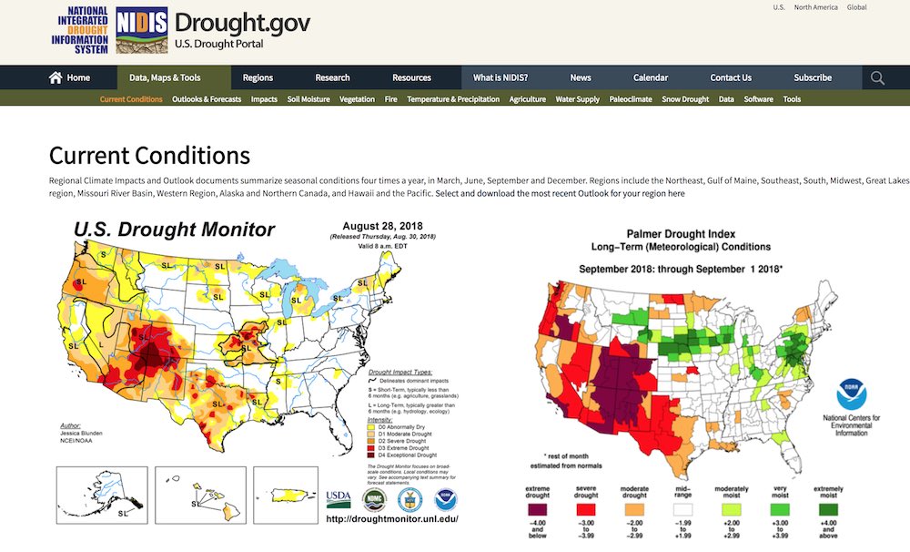
National Integrated Drought Information System – Sponsored by the National Oceanic and Atmospheric Administration (NOAA), this site has a ton of data about drought and soil moisture, however, their projections only go a few months into the future. Still, there is plenty of interesting info to look at.
Extreme Rainfall
Under a changing climate extremes of drought *and* rainfall can exist in the same place. Certain places will get less *total* rainfall, but the rain they do get will come all at once. Other places will get wetter, with more and more rainfall, much of it extreme, for example the rains after Hurricane Harvey were responsible for the majority of flooding in Houston. So knowing your risk to rainfall events could be pretty useful. Unfortunately, most of these tools will not give you an idea of extreme weather events, just overall changing patterns.
Northwest Climate Toolbox – Created by the Applied Climate Science Lab at the University of Idaho, it’s called the “Northwest Climate Toolbox”, despite covering the whole United States. It presents data as easily interpreted box plots, and not maps, but still *very* useful. It combines the RCP 8.5 scenario output of 20 climate models. It can plot a whole range of parameters (so we’ll probably see it later in this post), but in this section we will concentrate on precipitation.


Climate Wizard by The Nature Conservancy – This tool uses 16 climate models to show projection of temperature and precipitation changes for the US and other countries around the world. This tool uses the older climate scenario designations, where A2 is the worst case. This tool is probably not as good as the USGS tool, but it’s a little easier to use, although it’s starting to get a little old. Combined with the Northwest Climate Toolbox described above, it should give you a good idea of coming changes.

US Geological Survey National Climate Change Viewer – The USGS Climate Viewer tool also shows precipitation changes. Select “Precipitation” from the Variable menu. See above for further descriptions about how to work this tool.
What is my risk of FLOODING from extreme rainfall events?
At the moment this is a complex question. That data probably exists somewhere, but it is not readily available in an easily digested format. Your risk is a combination of your risk of extreme rainfall and the geography of where you live. Do you live near a creek or river? I have friends that live in Friendswood, Texas, in an area that had never flooded. With the epic rain that came with Hurricane Harvey they had 6 feet of water inside their house. Pretty much even the tiniest creek can turn into a raging torrent with enough precipitation.
One possibility is to use historical flood maps, although under conditions of changing climate, these sorts of maps are not accurate. But they should give you some idea. So combine historical flooding data with projections of increased rainfall from the tools above to get a rough idea of your risk.
Some flooding mapping tools…
FEMA Flood Mapping Tool – clunky map. Uses historical data, so does not take climate change into account.
FloodTools.com – nice graphical display but take it with a grain of salt. Not sure where they get their data (probably from FEMA), and they are also trying to sell you flood insurance.
Coastal Flooding
Coastal flooding from climate change will eventually remake the entire coast from Texas to Maine, at a cost of billions or trillions of dollars and the migration of hundreds of thousands to millions of people. Entire neighborhoods in major coastal cities will eventually be underwater. In some places this will happen sooner rather than later. And it’s not just sea level rise that contributes. For every bit of sea level rise, there is an even larger increase in the height of the storm surge (see below). There are several excellent mapping tools that have been developed to help you determine your future risk.
How do I know what sea level to pick when using these tools??
For most of these tools you have to pick an amount of sea level rise to start with. You can use the table below as a guide. This data is probably an underestimate. A safe bet would be to choose 2 feet of rise by 2050, and 5 feet of rise by 2100 to see the effects in your area.
Projected Sea Level Rise Caused by Climate Change
Sea level rise due to climate change given in feet of rise, relative to the year 2000. Data from the US Global Change Program. Numbers are 19 year averages, centered on the year indicated. Note the exponential nature of the change from left to right for any given scenario. These numbers are likely UNDERestimates. Recently observed ice loss from Antarctica are not figured into this information and will likely bump actual sea level rise by a row or two. Catastrophic tipping points are also not considered in this information. Data from... https://science2017.globalchange.gov/chapter/12/| Scenario | 2020 | 2030 | 2050 | 2100 |
|---|---|---|---|---|
| Low (RCP2.6) | 0.2 | 0.3 | 0.5 | 1.0 |
| Intermediate-Low | 0.3 | 0.4 | 0.8 | 1.6 |
| Intermediate (RCP4.5) | 0.3 | 0.5 | 1.1 | 3.3 |
| Intermediate-High | 0.3 | 0.6 | 1.4 | 4.9 |
| High | 0.4 | 0.7 | 1.8 | 6.6 |
| Extreme (RCP8.5) | 0.4 | 0.8 | 2.1 | 8.2 |
More discussion about sea level rise from… The Union of Concerned Scientists and the US Global Change Program
What is the relationship between sea level rise and storm surge?
It’s important to remember that even a small bit of sea level rise equates to a much greater increase in storm surge and flooding. This graphic from the Union of Concerned Scientists explains it well.

What if I don’t live near the sea, what is my risk of flooding?
Please see the end of the previous section on Extreme Rainfall for that discussion.
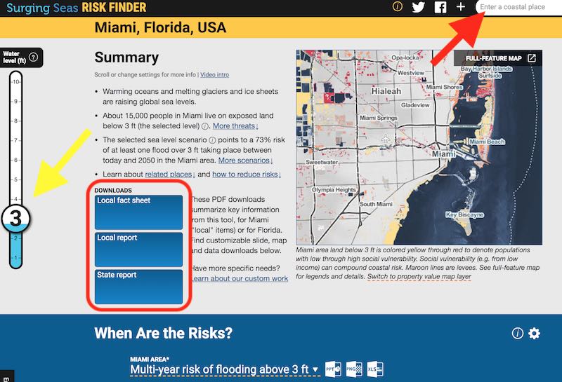
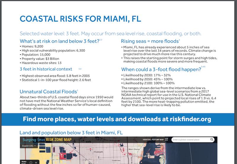
Climate Central Surging Seas Risk Zone Map – This is a really well done tool for mapping coastal flooding risk from sea level rise. It is based on data provided by NOAA (see next tool), but they take that data and present it in a variety of useful ways. There are two ways to access this tool, using a map, or by generating a report, complete with charts and graphs. The reports can even be downloaded for later use.

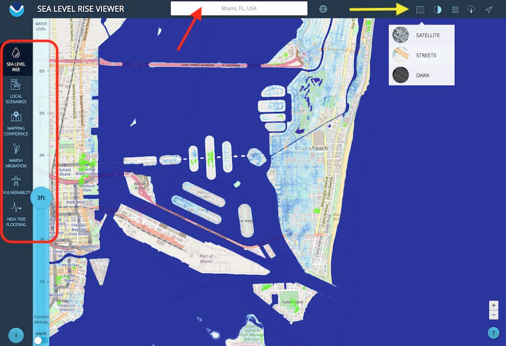
NOAA Sea Level Rise Viewer – The National Oceanic and Atmospheric Administration put together this tool. This data set forms the core of the Climate Central tool shown above. It has a few less bells and whistles, making it a little easier to use. One nice thing it has that the Climate Central tool does not have, is the ability to use street maps instead of satellite images as the background map. Maybe you can pick out the street you live on and see when it will be underwater.
Forest Fire
There are many tools to look at current fires and near term risk, but only the Northwestern Climate Toolbox shows you future risk. The plethora of other near term risk and current fire tools are primarily provided by the National Interagency Coordination Center (NICC), with a great fire mapping tool provided by the USGS.
Northwest Climate Toolbox – Created by the Applied Climate Science Lab at the University of Idaho, the “Northwest Climate Toolbox” covers the whole United States. Data is presented as easily interpreted box plots of RCP 8.5 scenario data from 20 climate models.

National Interagency Coordination Center – Provides a four month outlook for fire risk in the US. From their web page… “The main objectives of the National Significant Wildland Fire Potential Outlooks are to improve information available to fire management decision makers. These assessments are designed to inform decision makers for proactive wildland fire management, thus better protecting lives and property, reducing firefighting costs and improving firefighting efficiency. ”


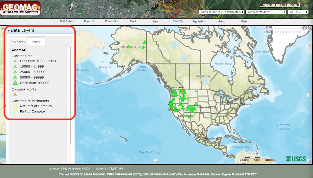
GEOMAC Wildland Fire Support – Built by our pals at the USGS, this tool shows information about all active fires in the United States. It can also display historical information. You can zoom in and get actual acreage consumed and other information. Also, when you zoom in using the “Data Layers” tab (red box in second image below)

Economic Impacts
Economic impacts due to climate change will vary from region to region. If you live in an already dry western state, things will get drier, impacting agriculture, forestry, mining and so on. If you live along the coast, sea level rise and storm surge will drive economic impacts. Some places may even benefit somewhat, with far Northern US states gaining population and resources. Although if you already live in the Northern states, an influx of hundreds of thousands of climate refuges may not appeal to you, even if they are Americans, let alone the millions worldwide that will eventually need new homes.
There are no interactive tools available online yet. The static maps below can give you a good idea of the economic impacts at the state level. These are from a recent study titled “Estimating economic damage from climate change in the United States“, by Solomon Hsiang and his coauthors, who are economists from academia, government and industry. They created a model and framework of impacts that can be adjusted as new data becomes available.
Global Policy Lab at UC Berkley – where some of the authors of this paper were from, hosts the data used in this study. They have made this data publicly available. You can download spreadsheets that give economic damages by county (<–click) for the entire US, broken down by total damage, by sector and by income group. Here are some summary maps for the whole country.

The map above shows that the greatest economic damage from climate change will occur in the lower half of the US. Two very populous states, Texas and Florida are especially hard hit. Far Northern states may benefit in some ways from these changes, although the country as a whole looses.

Very interesting map above. Again, worst damages in southern half of the US, with some benefits to the North. However, note that labor risk from heat goes up over the entire country, and property and violent crimes increase in the North, likely due to having more people there due to climate migration from South to North (see below).
Say ‘Hello’ to your new neighbors – Impacts of climate change on internal migration inside the US, from an earlier post.
Mathew Hauer from the Department of Geography in the University of Georgia, plucked some low hanging fruit with his study trying to figure out exactly where the people displaced from rising seas will go. Interestingly, while many studies have looked at how MANY people will be displaced, nobody looked at WHERE they will go.
In his paper titled “Migration induced by sea-level rise could reshape the US population landscape”, Dr Hauer took the novel approach of correlating the areas in the US that will be impacted by rising seas with IRS data that shows that people tend to move to areas where they have family or better economic opportunities.
He assumed 1.8 meters (~6 feet) of sea level rise by 2100, impacting 319 coastal counties in the US. Cross referencing the places where people will be displaced with the IRS migration data shows that the Miami area will lose about 2.5 million people, New Orleans about 500,000, and New York City area about 500,000. The “winners” include: the Austin area, which would be set to gain 818,000 people; Orlando would gain 461,000; and Atlanta 320,000. The crazy cool figure below summarizes the study’s findings.

The author concludes his paper by saying… “(sea level rise) is currently framed as a coastal hazard, but the migratory effects could ripple far inland. My results show the importance of accounting for future migrations associated with climate change in long-range planning processes for disaster management, transportation infrastructure, land-use decisions, and so on.”
Dr Hauer did some excellent work, but The Climate Advisor thinks it will probably be worse, because his analysis is focussed only on displacement from sea level rise. Let’s not forget all we have looked at, extreme heat, extreme rain, floods, drought, forest fires, and most importantly in this case, the economic impacts.
And what about the millions of people projected to be displaced worldwide by sea level rise? Where will they go? Being one of the largest emitters of carbon dioxide in history, what part of the load will the US be expected to take?
Also, 1.8 meters of sea level rise is probably on the low-end of the actual risk. A rise of more than 1.8 meters would be catastrophic for the US, let alone the rest of the world, and would probably mean the displacement of billions, not millions, and the death of hundreds of thousands of people through starvation and conflict. But let’s not get ahead of ourselves, there’s still plenty we can do to prevent the worst case.
Summary
Congratulations for making it to the end of this long post! Hopefully you visited the different sites and tried out the different tools and learned about some of your own risks to climate change. It’s not pretty. What we do as individuals and as a society in the next few years will decide how bad it gets. Make no mistake, it will be (and is becoming) bad, but we can keep it from becoming biblical.
If you have found a particular tool or resource that you think should be listed here, or an idea to make this page more useful, or if you have any questions about how to use these tools… please contact The Climate Advisor via Twitter or “contact (at) theclimateadvisor.com”. Thanks!